

A Journey to a User-Friendly, Data-Powered Writing Tool
"I feel like I need some kind of cheat sheet to finish and know what to do?"
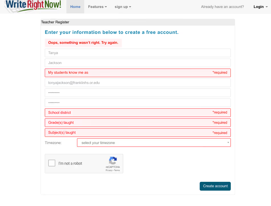
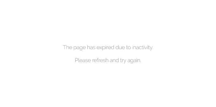
That teacher's words during user testing crystallized everything for Gerald's team. After months of uncertainty about why their product wasn't working, watching educator after educator struggle with the sign-up process finally gave them the clarity they'd been desperately seeking. The BRT team could see exactly what had gone wrong—they'd built a sophisticated research showcase when teachers needed a simple, intuitive tool.
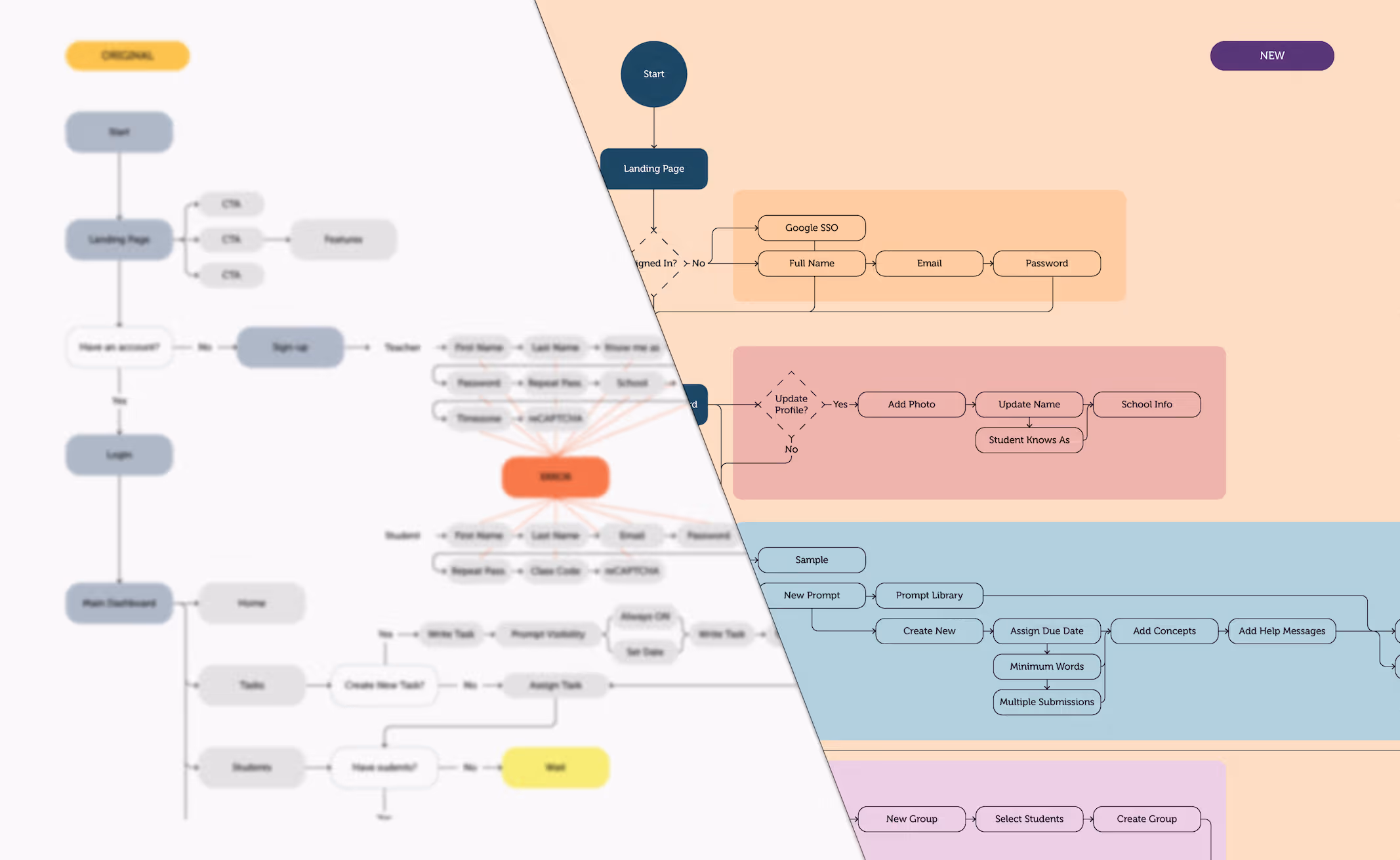
But recognizing the pattern was just the beginning. Now they had to rebuild a three-year-old product around an entirely different philosophy—without throwing away years of valuable research.
The existing WriteRightNow platform couldn't have had a more challenging start. Usability issues, confusing navigation, and research-heavy interfaces had created what one teacher fretted "Am I supposed to know what I'm looking at?" We needed to transform academic complexity into teacher-friendly simplicity.
Armed with three breakthrough insights from our strategic work—invisible expertise, teacher workflow focus, and earning the right to complexity—we faced a critical question: How do you fix a broken product without starting over completely?
The three fundamental philosophy shifts that required rebuilding the UX from the ground up:

INVISIBLE EXPERTISE, VISIBLE VALUE
How do we hide years of sophisticated research behind an interface so simple that teachers can use it on a Tuesday afternoon? The product was drowning in academic complexity that even researchers found confusing.
TEACHER WORKFLOW, NOT ACADEMIC WORKFLOW
How do we design around the reality of a teacher's day instead of the logic of our research process? Every screen needed to answer "What does this do for me right now?" before showcasing data sophistication.
EARN THE RIGHT TO COMPLEXITY
How do we get teachers successfully using basic features before revealing the deeper capabilities? The platform had been trying to prove its worth upfront instead of demonstrating immediate value first.
SURGICAL IMPLEMENTATION, NOT COMPLETE REDESIGN
What to do when everything seems to be going wrong
With clarity about what had gone wrong, we didn't need to dig any deeper—we needed to systematically fix the patterns holding teachers back. The question wasn't "What else is broken?" but "How do we implement these insights into specific product decisions?"
That teacher's "cheat sheet" comment revealed the core issue—every screen was trying to collect or display our research instead of helping them get something done. We buried the research sophistication that confused users and led with immediate teacher value:
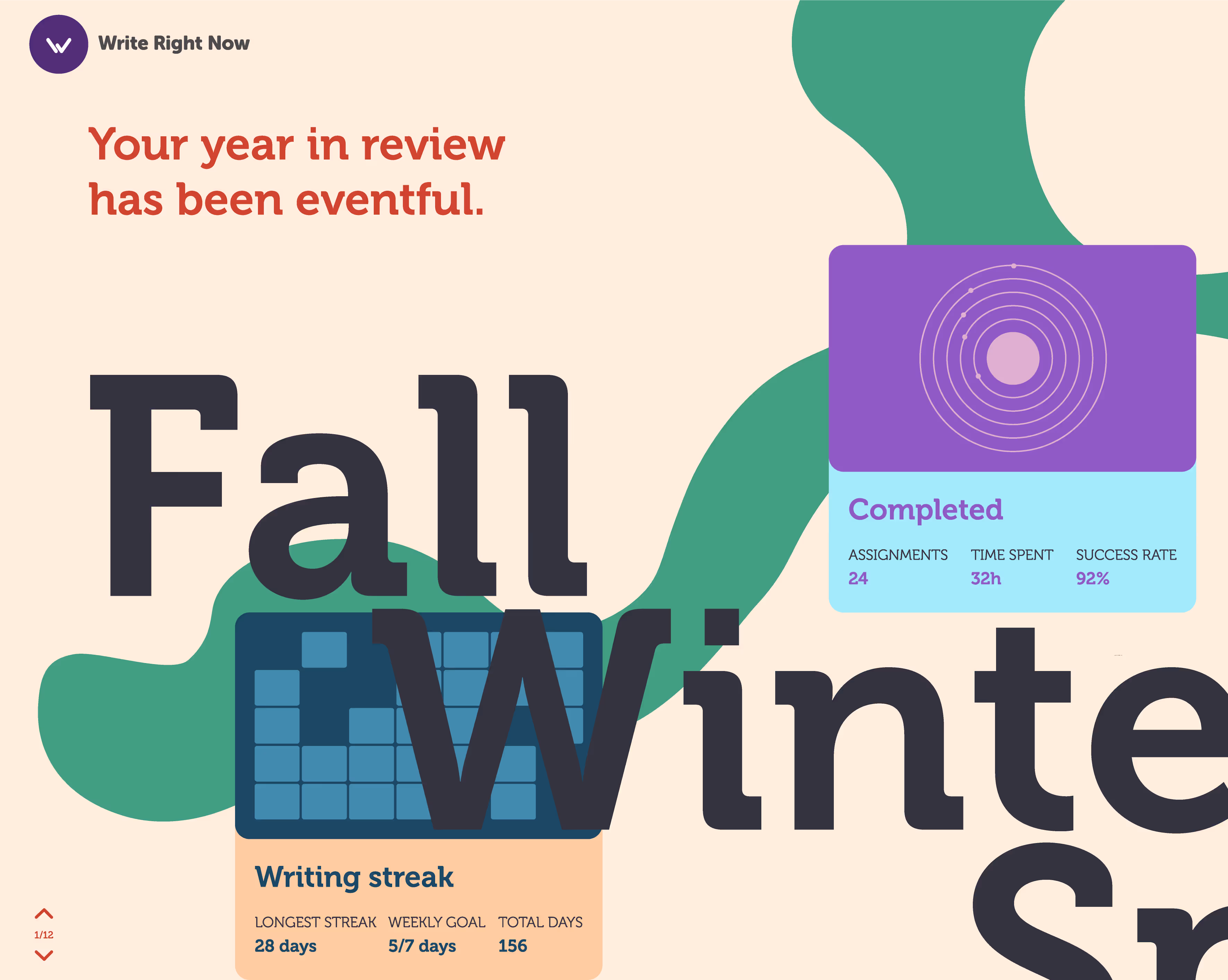
- Reduced sign-up form fields by 80% (from data collection to basic teacher info)
- Replaced academic terminology with "How do I help my students write better?"
- Led with immediate teacher wins instead of diagnostic complexity


“This is a trap we fall into all the time. I already know the answer so I design with the assumption that the value should just be obvious. But teachers don't wake up thinking 'I need diagnostic writing data.' They wake up thinking 'How do I help my students write better today?'. It's not that your research is wrong—it's that you're leading with your strength instead of their need.”
Facing the hard truths
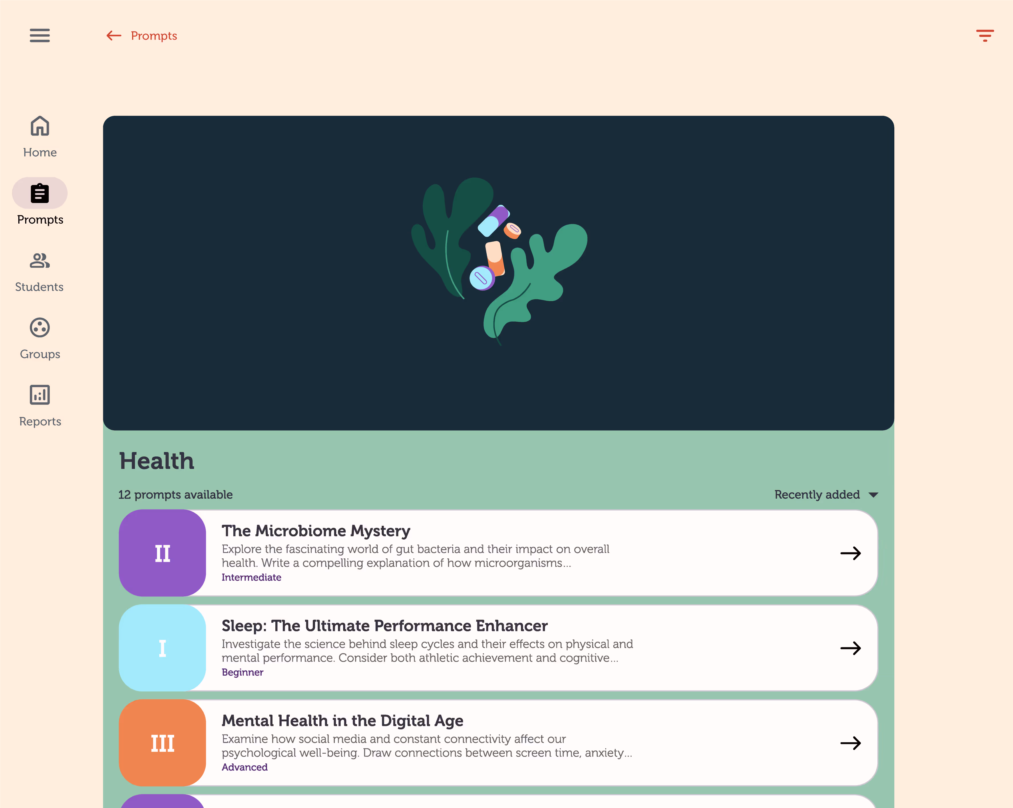
Instead of asking teachers to navigate a labyrinth, we reorganized around a teacher's actual Tuesday afternoon:
- "Quick student check-in" instead of a "diagnostic assessment dashboard"
- "This week's writing focus" instead of "performance analytics overview"
- "Prompt library" instead of "research-based writing stimulus"
It wasn’t the idea. It was the execution.
We reversed the information hierarchy—immediate value first, then reveal sophistication:
- Teachers could assign prompts and see student engagement within 5 minutes
- Diagnostic insights emerged gradually as teachers used basic features
- Research depth became a reward for engagement, not a barrier to entry


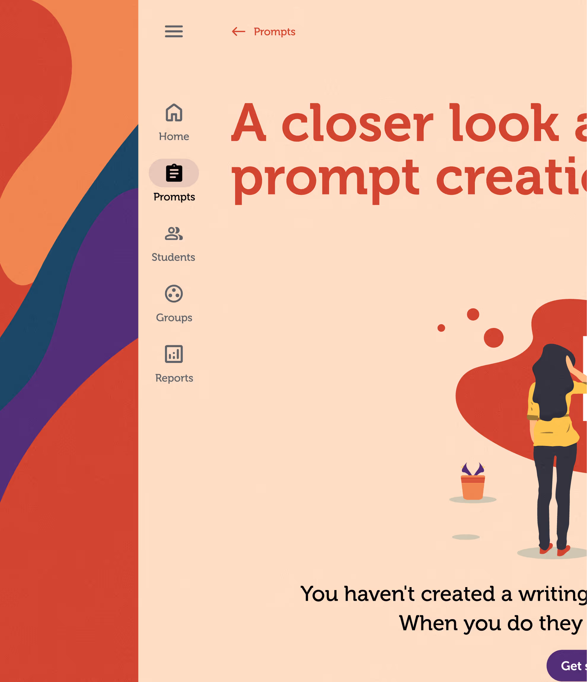
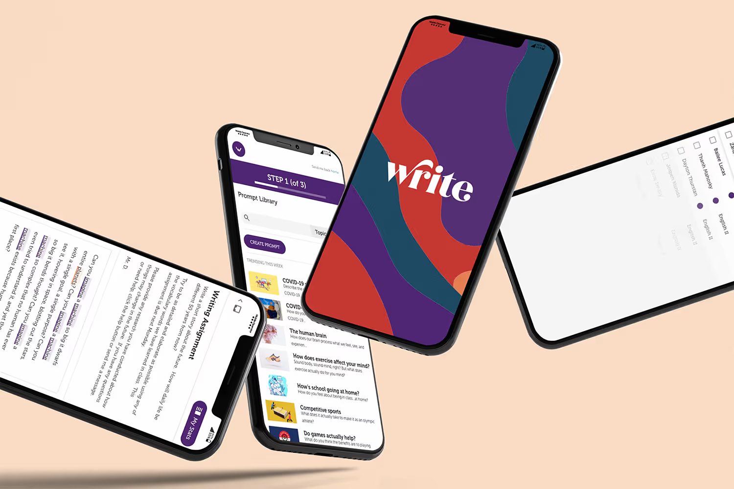
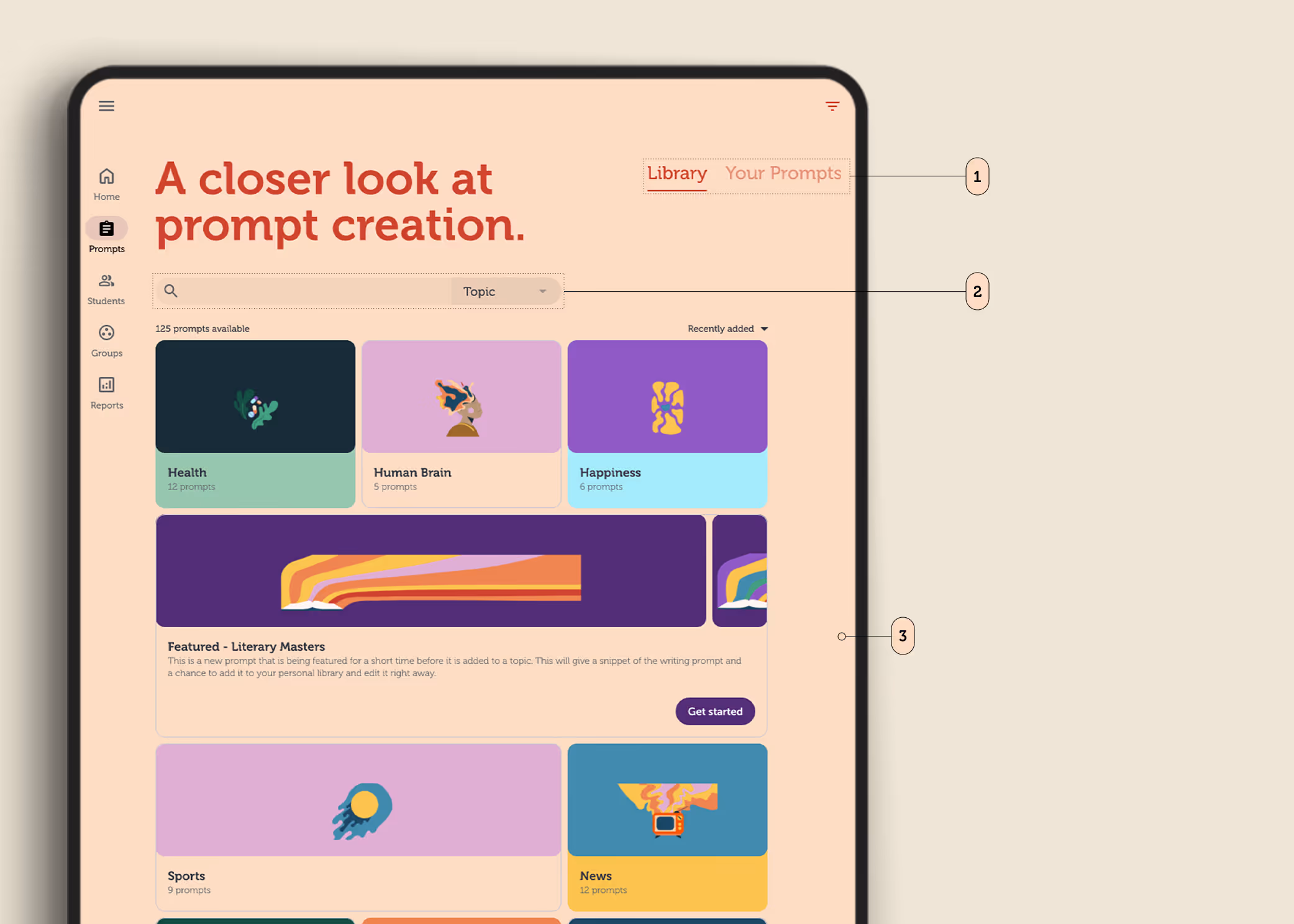
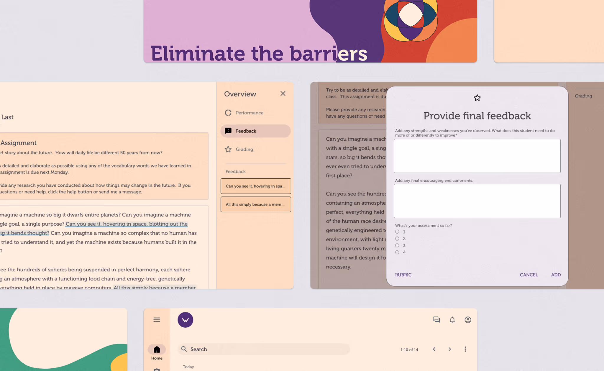
Implementing Insight: The Prompt Library
When pattern recognition meets practical application
Armed with our three implementation principles, we needed to identify the ONE feature that would prove teachers could get immediate value without drowning in our research sophistication.
The answer emerged directly from watching those user testing sessions. Teachers kept asking "What am I supposed to do with this?" They needed immediate utility, not impressive data displays.

From user frustration to feature clarity
Remember that teacher who needed a "cheat sheet"? Her struggle revealed the perfect entry point. Instead of showcasing our diagnostic capabilities upfront, we'd lead with something every teacher needed right now: effective writing prompts.
The Prompt Library became our implementation of "earning the right to complexity":
- Immediate value: Teachers could find and assign prompts in under 2 minutes
- Teacher workflow: Organized by subject and classroom, not research categories
- Hidden sophistication: Our years of research informed prompt quality, but invisibly
The Prompt Library validated what we'd learned from watching those teachers struggle: when you solve the immediate problem first, users become willing partners in discovering deeper capabilities.
.avif)
APPLYING THE PATTERN FIXES TO THE CORE EXPERIENCE
From research showcase to teaching tool
With the Prompt Library proving teachers could get immediate value, we faced the bigger challenge: how do we apply our three pattern fixes to the heart of the platform—the actual teaching and learning experience?

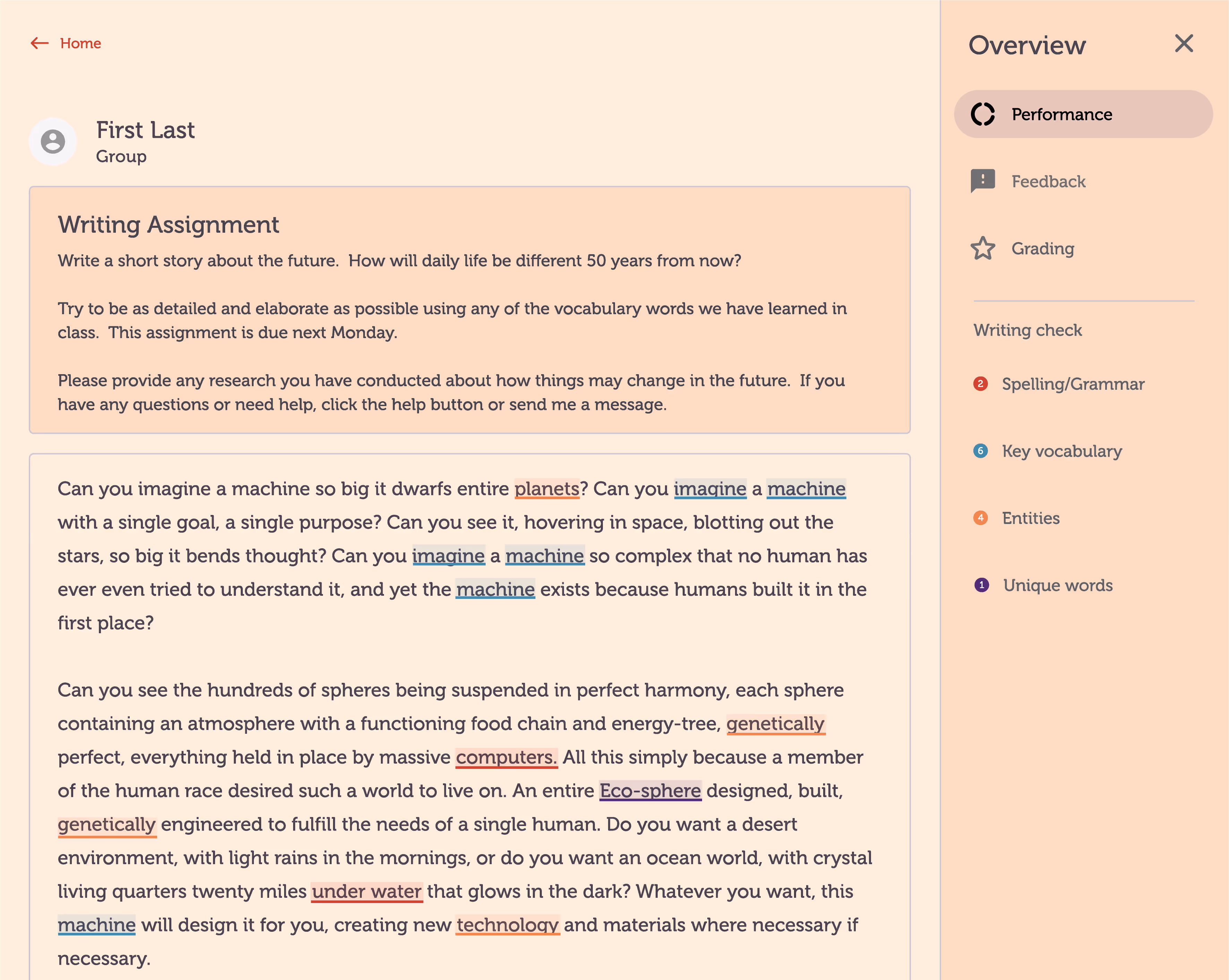

Pattern Fix in Action: Student Writing
Remember our insight about "leading with their need instead of our strength"? We redesigned the student writing experience around this principle:
- Before: Complex diagnostic interface that displayed research sophistication
- After: Simple writing space with helpful prompts, diagnostic insights hidden in background.
- Teacher Benefit: Students could start writing immediately, teachers received actionable feedback without drowning in data.

Earning trust before 'showing off'
Instead of overwhelming teachers with diagnostic capabilities upfront, we revealed insights gradually:
- After the first week: Teachers see student engagement and completion rates
- After the second week: Basic writing improvement patterns emerge
- After the first month: Full diagnostic insights become available to teachers who've proven platform value
Every feature had to pass the "Tuesday afternoon test". Could a tired teacher with 20 minutes between classes actually use this? We stripped away everything that didn't immediately help teachers help their students write better.
The result wasn't just a better product—it was proof that sophisticated research could enhance teaching without complicating it.
“It was an absolute pleasure to work with you! Your insight and guidance are going to save us significant development time and result in a high-quality product.”
When pattern recognition meets real-world transformation
Eighteen months earlier, Gerald's team had watched teacher after teacher abandon their sign-up process. "Teachers can't even create an account" had become their reality.
But seeing the patterns they'd been trapped in, rather than just working harder on solutions that weren't working, proved that they didn't need to start over. The BRT team didn't need a complete redesign. They needed someone to help them read the label on their own jar.
The transformation speaks for itself:
5000+
98%

Get insights on EdTech positioning.
One insight for EdTech leaders on narrowing the buyer and building more of what works, instead of more. Every other Tuesday.